Getting started
Challenge
Business needs
My Role & Team
Legacy Experience
Journey Mapping
Competitive Research
Workflows
Components
Style guides
Typography
Solution
Registration Outcomes
Learnings
How I simplified Lyca Mobile’s SIM registration experience across 8 regulated markets
Turning a fragmented, country-dependent registration experience into a clearer and more scalable journey for Lyca Mobile customers.

Disclaimer
Before we dive in, please note that some confidential or sensitive information has been removed from this case study due to my non-disclosure agreement. The work shown here focuses on my design process, thinking, and contribution to the project.
This case study focuses on the Belgium registration experience. Some registration requirements and verification steps may vary across countries, but the overall design approach was created to be flexible and adaptable for different markets.
Getting Started
Registering a SIM shouldn't feel like navigating a different system in
every country.
Lyca Mobile operates across 22+ markets, but SIM registration requirements aren't the same everywhere. In 8 markets, customers were required to complete registration before they could use their SIM.
Challenge
The problem wasn't just the UI. It was the complexity behind it.
Different requirements, identity verification methods, manual data entry and technical dependencies had accumulated into a fragmented experience.
Before working on the interface, I segregated the problem into five areas that were contributing to the overall complexity.

Business Needs
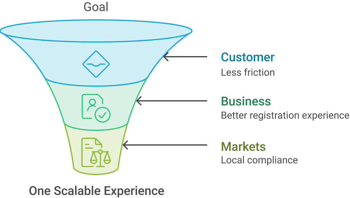
The experience had to work for the business, the customer, and every market in between.
The goal wasn't simply to make registration look cleaner. The experience needed to support local registration requirements, reduce unnecessary effort for customers, accommodate different verification methods, and provide a structure that could adapt as country requirements changed.
My Role & Team
Good product design is rarely a solo effort.
The Lyca Mobile registration experience was shaped through close collaboration across design, research, business, engineering, delivery, and QA.
I worked with Sandeep Das, My Manager, alongside Visakan Kanagarajan on UX research, Ebenezer Sam as Business Analyst, Jithender Reddy as Project Manager, and Ganesh as Delivery Manager.
On the engineering side, I collaborated with Suraj C on frontend development and Yeshwani KP on backend development, with Nagaraj Hittalamani leading QA.
Together, we worked through the user, business, regulatory, and technical constraints to create a registration experience that could scale across different markets.







What I owned
From understanding the problem to shaping the final experience, I owned the design across the journey.
User Experience
Registration Journey
Worksflows
Interaction Design
Product
Requirement & Flows
Verification Experience
Edge Cases
User Interface
UI Design
Responsive Design
Components Library
Legacy Experience
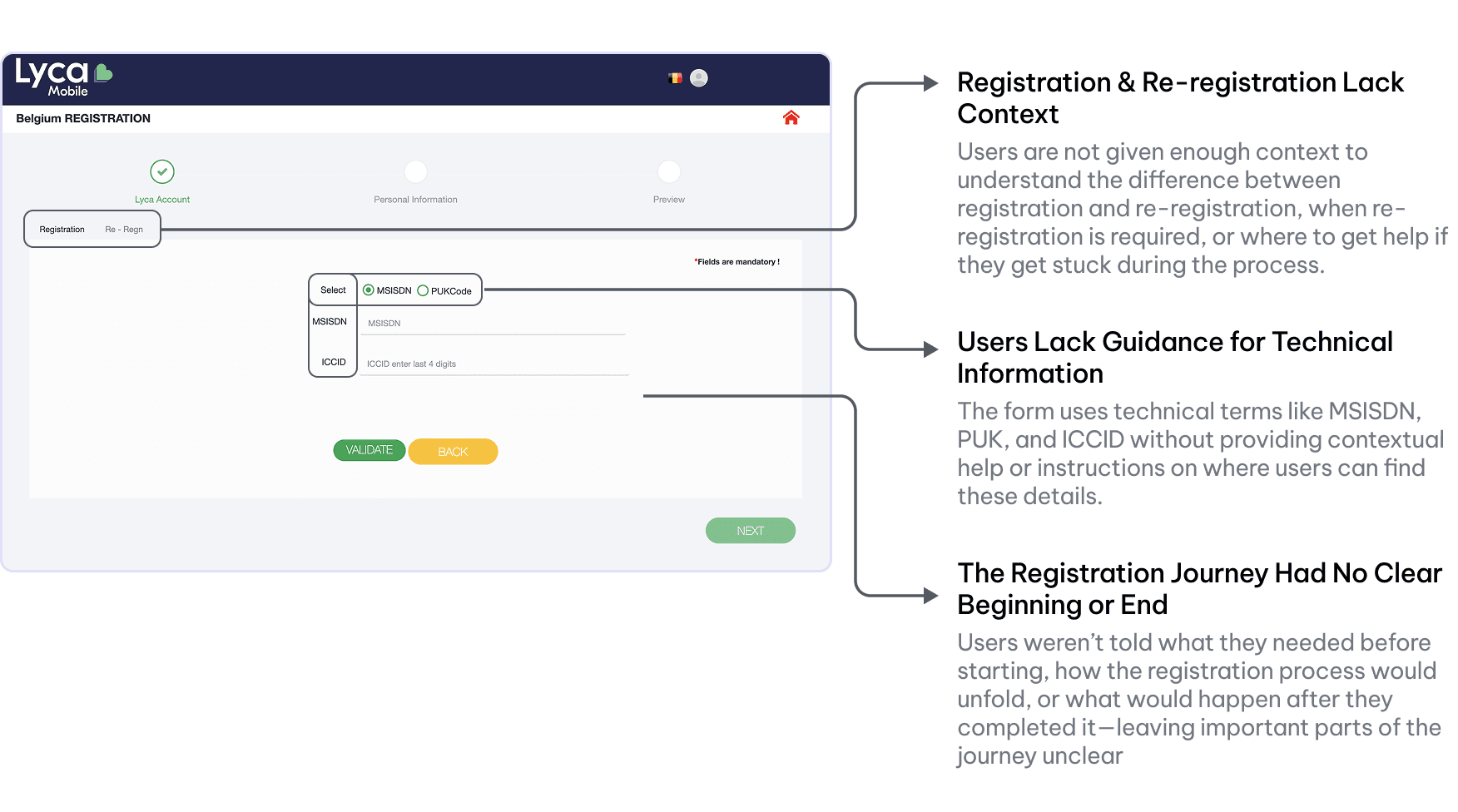
The form asked users to get everything right - without telling them how.
The legacy experience handled the necessary registration requirements, but the journey had become difficult to navigate. Information hierarchy was weak, the interface varied across experiences, and users were asked to work through steps without always knowing what was expected next.

Journey Mapping
Small moments of frictions were adding up to Bigger problem.
From entering SIM details to completing identity verification, users faced friction at multiple points in the registration journey. Unclear terminology, lengthy manual forms, missing guidance and country-specific verification requirements made the experience harder to navigate than it needed to be.
I mapped the journey to understand where users experienced confusion, unnecessary effort and missing information and where the experience could take more responsibility instead of asking users to figure everything out themselves.

Competitive Research
Why make customers type everything when verification could do more of the work?
I looked beyond Lyca Mobile to understand how other telecom operators were handling identity verification across different markets. The research showed a clear pattern: operators such as Comviq, T-Mobile, and Proximus were using established digital identity and KYC solutions to simplify verification and reduce manual data entry.
Belgium’s Proximus

Uses Itsme for ID
Verification
Sweden’s Comviq

Uses veriff ID and Bank ID for ID Verification
Germany’s T-Mobile

Uses IDnow. for ID Verification
The registration problem was bigger than the form.
The competitive research helped me see that improving the experience wasn't only about making 16–18 fields easier to complete. There was an opportunity to rethink the verification journey itself - reducing unnecessary manual input, giving users clearer guidance, and creating a registration experience that could scale across different market requirements.
Why make customers do manually what technology can verify?
Manual registration created unnecessary effort, while identity-verification solutions offered an opportunity to reduce data entry, improve accuracy, and create a faster registration experience.

Workflows
One registration journey had to support multiple paths.
The registration flow couldn't be a single linear journey. Depending on the country, SIM status, and available verification method, users could follow different paths. I mapped these scenarios to create a common structure while allowing the experience to adapt where required.

Components
A consistent experience needed more than consistent screens.
I translated the new experience into reusable interface patterns so that common interactions could remain consistent across the registration journey. This included form elements, verification options, navigation patterns, guidance components, states, and responsive behaviour.


Style Guides
The visual language needed to make a complex process feel approachable.
I used Lyca Mobile's existing visual language as a foundation while refining hierarchy, spacing, typography, colour, and component behaviour to create a clearer and more consistent registration experience across screen sizes.
Foundational Colours
Primary colours
P1
P2
Core colours
C1
C2
Secondary colours
S1
S2
S3
S4
Text Colours
Text colours
T1
T2
T3
T4
Core colours
B1
B2
B3
B4
B5
B6
Semantic Colours
SE1
SE2
SE3
SE4
SE5
Typography
Typography that keeps the experience clear and consistent.
I used GT Eesti LC Display, Lyca Mobile’s brand typeface, throughout the registration experience to maintain brand consistency and create a clear, cohesive visual language.

Solution
I turned a fragmented registration process into one familiar journey.
The redesigned experience introduced a clearer step-by-step structure, reduced unnecessary input, provided contextual guidance, and supported different identity-verification paths. The result was a more consistent experience that could adapt to country-specific requirements without making every journey feel completely different.


One registration journey. Eight markets. Different verification requirements.
Each market had its own registration and identity-verification requirements, so the experience needed to adapt to the appropriate IDV solution while maintaining a consistent journey across countries.

What if users didn't have to type what we already knew?
The identity-verification flow could retrieve several user and identity details through the IDV provider. I mapped the available API responses against the registration requirements to identify which fields could be prefilled and which still needed to be entered manually.
This helped reduce unnecessary typing while keeping country-specific requirements intact.

Entered by the user
Information that user need to enter manually.
Retrieved from IDVs
Identity information returned through the verification API, such as date of birth, document dates, gender, nationality, national number, communication details and issuing authority.
Registration Outcomes
Not every verification journey ends the same way.
Once the required information is collected and verified, the experience guides customers to the appropriate outcome - whether registration is successful, requires another attempt, or cannot be completed online.


Learnings
The hardest part wasn't simplifying the UI. It was understanding the complexity behind it.
This project taught me that designing a simpler experience doesn't always mean removing steps. In a regulated product, many of those steps exist for a reason — the real challenge is making the complexity understandable without making the user carry it.
I also learned to look beyond individual screens and understand the entire journey. Small moments of confusion around SIM details, required documents, verification methods, and registration outcomes could eventually become a much bigger reason for users to abandon the process.
Design for the journey, not just the screen
A registration experience can look simple screen by screen but still feel difficult when the overall journey is unclear. Mapping the complete flow helped me identify where friction was actually accumulating.
Complex systems need clear communication
Country-specific regulations, ID verification methods and technical dependencies couldn't simply be removed. Instead, I focused on explaining what users needed to know at the right moment.
Edge cases are part of the experience
Success isn't the only state worth designing for. Rejections, verification failures, age restrictions and incomplete data all need clear explanations and appropriate next steps.
“I started this project thinking about how to improve a registration interface. I finished it thinking much more about how to design experiences around complex systems.”
Looking for the right team and
the right challenge.
I’m currently open to Senior Product Designer,
AI Product Designer, and Design Lead opportunities.
How I simplified Lyca Mobile’s SIM registration experience across 8 regulated markets
Turning a fragmented, country-dependent registration experience into a clearer and more scalable journey for Lyca Mobile customers.
Disclaimer
Before we dive in, please note that some confidential or sensitive information has been removed from this case study due to my non-disclosure agreement. The work shown here focuses on my design process, thinking, and contribution to the project.
This case study focuses on the Belgium registration experience. Some registration requirements and verification steps may vary across countries, but the overall design approach was created to be flexible and adaptable for different markets.
Getting Started
Registering a SIM shouldn't feel like navigating a different system in every country.
Lyca Mobile operates across 22+ markets, but SIM registration requirements aren't the same everywhere. In 8 markets, customers were required to complete registration before they could use their SIM.
Challenge
The problem wasn't just the UI. It was the complexity behind it.
Different requirements, identity verification methods, manual data entry and technical dependencies had accumulated into a fragmented experience.
Before working on the interface, I segregated the problem into five areas that were contributing to the overall complexity.
Business Needs
The experience had to work for the business, the customer, and every market in between.
The goal wasn't simply to make registration look cleaner. The experience needed to support local registration requirements, reduce unnecessary effort for customers, accommodate different verification methods, and provide a structure that could adapt as country requirements changed.
My Role & Team
Good product design is rarely a solo effort.
The Lyca Mobile registration experience was shaped through close collaboration across design, research, business, engineering, delivery, and QA.
I worked with Sandeep Das, My Manager, alongside Visakan Kanagarajan on UX research, Ebenezer Sam as Business Analyst, Jithender Reddy as Project Manager, and Ganesh as Delivery Manager.
On the engineering side, I collaborated with Suraj C on frontend development and Yeshwani KP on backend development, with Nagaraj Hittalamani leading QA.
Together, we worked through the user, business, regulatory, and technical constraints to create a registration experience that could scale across different markets.
What I owned
From understanding the problem to shaping the final experience, I owned the design across the journey.

Legacy Experience
The form asked users to get everything right - without telling them how.
The legacy experience handled the necessary registration requirements, but the journey had become difficult to navigate. Information hierarchy was weak, the interface varied across experiences, and users were asked to work through steps without always knowing what was expected next.
Journey Mapping
Small moments of frictions were adding up to Bigger problem.
From entering SIM details to completing identity verification, users faced friction at multiple points in the registration journey. Unclear terminology, lengthy manual forms, missing guidance and country-specific verification requirements made the experience harder to navigate than it needed to be.
I mapped the journey to understand where users experienced confusion, unnecessary effort and missing information and where the experience could take more responsibility instead of asking users to figure everything out themselves.
Competitive Research
Why make customers type everything when verification could do more of the work?
I looked beyond Lyca Mobile to understand how other telecom operators were handling identity verification across different markets. The research showed a clear pattern: operators such as Comviq, T-Mobile, and Proximus were using established digital identity and KYC solutions to simplify verification and reduce manual data entry.
Belgium’s Proximus
Uses Itsme for ID
Verification
Sweden’s Comviq
Uses veriff ID and Bank ID for ID Verification
Germany’s T-Mobile
Uses IDnow. for ID Verification
The registration problem was bigger than the form.
The competitive research helped me see that improving the experience wasn't only about making 16–18 fields easier to complete. There was an opportunity to rethink the verification journey itself - reducing unnecessary manual input, giving users clearer guidance, and creating a registration experience that could scale across different market requirements.
Why make customers do manually what technology can verify?
Manual registration created unnecessary effort, while identity-verification solutions offered an opportunity to reduce data entry, improve accuracy, and create a faster registration experience.
Workflows
One registration journey had to support multiple paths.
The registration flow couldn't be a single linear journey. Depending on the country, SIM status, and available verification method, users could follow different paths. I mapped these scenarios to create a common structure while allowing the experience to adapt where required.
Components
A consistent experience needed more than consistent screens.
I translated the new experience into reusable interface patterns so that common interactions could remain consistent across the registration journey. This included form elements, verification options, navigation patterns, guidance components, states, and responsive behaviour.
Style Guides
The visual language needed to make a complex process feel approachable.
I used Lyca Mobile's existing visual language as a foundation while refining hierarchy, spacing, typography, colour, and component behaviour to create a clearer and more consistent registration experience across screen sizes.

Typography
Typography that keeps the experience clear and consistent.
I used GT Eesti LC Display, Lyca Mobile’s brand typeface, throughout the registration experience to maintain brand consistency and create a clear, cohesive visual language.

Solution
I turned a fragmented registration process into one familiar journey.
The redesigned experience introduced a clearer step-by-step structure, reduced unnecessary input, provided contextual guidance, and supported different identity-verification paths. The result was a more consistent experience that could adapt to country-specific requirements without making every journey feel completely different.
One registration journey. Eight markets. Different verification requirements.
Each market had its own registration and identity-verification requirements, so the experience needed to adapt to the appropriate IDV solution while maintaining a consistent journey across countries.
What if users didn't have to type what we already knew?
The identity-verification flow could retrieve several user and identity details through the IDV provider. I mapped the available API responses against the registration requirements to identify which fields could be prefilled and which still needed to be entered manually.
This helped reduce unnecessary typing while keeping country-specific requirements intact.
Entered by the user
Information that user need to enter manually.
Retrieved from IDVs
Identity information returned through the verification API, such as date of birth, document dates, gender, nationality, national number, communication details and issuing authority.
Registration Outcomes
Not every verification journey ends the same way.
Once the required information is collected and verified, the experience guides customers to the appropriate outcome - whether registration is successful, requires another attempt, or cannot be completed online.
Learnings
The hardest part wasn't simplifying the UI. It was understanding the complexity behind it.
This project taught me that designing a simpler experience doesn't always mean removing steps. In a regulated product, many of those steps exist for a reason — the real challenge is making the complexity understandable without making the user carry it.
I also learned to look beyond individual screens and understand the entire journey. Small moments of confusion around SIM details, required documents, verification methods, and registration outcomes could eventually become a much bigger reason for users to abandon the process.
Design for the journey, not just the screen
A registration experience can look simple screen by screen but still feel difficult when the overall journey is unclear. Mapping the complete flow helped me identify where friction was actually accumulating.
Complex systems need clear communication
Country-specific regulations, ID verification methods and technical dependencies couldn't simply be removed. Instead, I focused on explaining what users needed to know at the right moment.
Edge cases are part of the experience
Success isn't the only state worth designing for. Rejections, verification failures, age restrictions and incomplete data all need clear explanations and appropriate next steps.
“I started this project thinking about how to improve a registration interface. I finished it thinking much more about how to design experiences around complex systems.”
Looking for the right team and
the right challenge.
I’m currently open to Senior Product Designer,
AI Product Designer, and Design Lead opportunities.
+91 83174 84558